
Pantone and Sherwin-Williams are Unified in 2020 Color of the Year Choices
Ahh, 2020! We’re not only entering a new year, but also a new decade. It’s a time of goal-setting, renewal, and looking ahead. While many of us began tackling our New Year’s resolutions, Pantone and Sherwin-Williams released their color forecasts into the world. Normally, these two companies choose colors that look completely different from one another. This year, however, their forecasted color choices are extremely similar. Don’t believe us? Take a look…
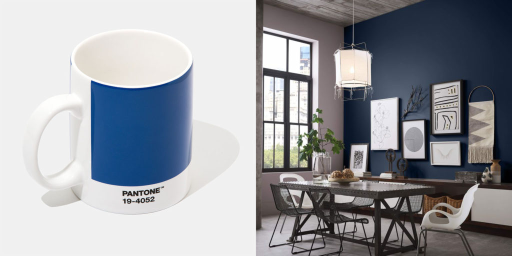
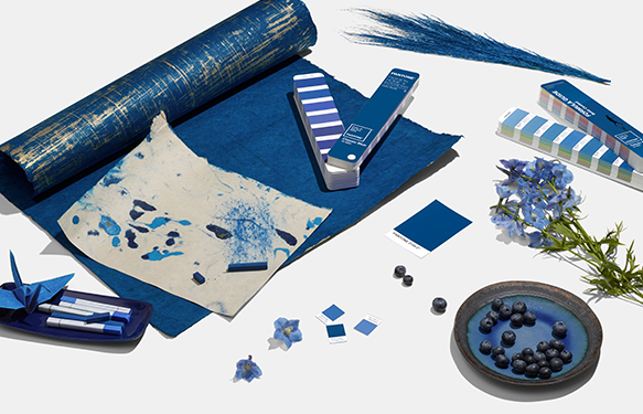
Both Pantone and Sherwin-Williams selected deep, classic blues for their 2020 Color of the Year. Shown here is Pantone Classic Blue and Sherwin-Williams Naval.
Why So Blue?
Both Pantone’s Classic Blue and Sherwin-Williams’ Calming Navy are fairly deep blue shades. Compare this to last year’s choices. In 2019, Pantone selected Living Coral, a vibrant pink, while Sherwin-Williams opted for Cavern Clay, a warm, deep neutral. Sure, last year’s colors were both warm tones, but they had entirely different attitudes. One was bright and rebellious, while the other was earthy and mysterious.
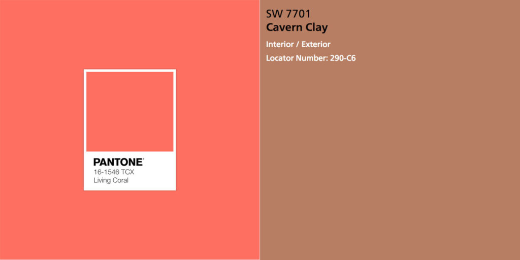
The 2019 Color of the Year selections from Pantone and Sherwin-Williams had completely different attitudes.
While we don’t know if Pantone and Sherwin-Williams were discussing their insights with one another, we do know that Color of the Year predictions are as much about trends as they are about aspiration. In this, the two companies seem united.
“We are living in a time that requires trust and faith,” explained Leatrice Eiseman, Executive Director of the Pantone Color Institute. “It is this kind of constancy and confidence that is expressed by PANTONE 19-4052 Classic Blue, a solid and dependable blue hue we can always rely on. Imbued with a deep resonance, Classic Blue provides an anchoring foundation. A boundless blue evocative of the vast and infinite evening sky, Classic Blue encourages us to look beyond the obvious to expand our thinking; challenging us to think more deeply, increase our perspective and open the flow of communication.”
Sue Wadden, Director of Color Marketing at Sherwin-Williams, shared a similar philosophy when discussing Naval SW 6244. . “People want to feel grounded and inspired to pursue their mental, physical and emotional well-being. Naval is reminiscent of the night sky, which people have looked to for centuries for guidance, as a muse and as a reminder to live more mindfully.”
Essentially, these deep blue hues embody not only our connection to nature, but also our desire for peace and harmony. Sounds like a worthy goal to us.
Getting Inspired by the 2020 Color of the Year
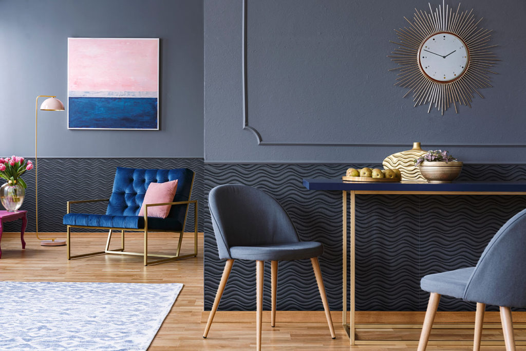
This year’s navy hues are both bold and easy to love. If you’re already thinking about ways to incorporate Naval and Classic Blue into your space, don’t fret! We have a few ideas for you.
1) Customize MirroFlex Wainscoting for a Unique Monochromatic Look
Wainscot panels are a hallmark of sophistication, but by using MirroFlex instead of traditional bead board, you can set your space apart. We love this monochromatic look in deep navy hues—especially with those gold accents!
The Formula | Wavation + Custom Color Match (MirroFlex Structures, Wainscoting)
2) Not into Solid Colored Walls? Use Photography in a Large Custom Mural
Maybe monochromatic spaces aren’t your cup of tea. No problem! A custom mural may be just the thing you need to pack a serious punch. Fusion from ATI is a great way to add photographic or illustrative murals to your wall that’s more sturdy than traditional vinyl.
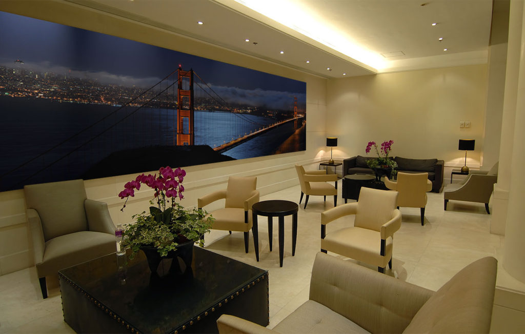
The Formula | Custom Mural on Digital HIPS (Fusion, Wall Mural)
3) Emulate a Clear Night Sky with Illuminated LED Panels
One of the most entrancing things about a clear night sky is the twinkle of the stars. ATI’s LumiSplash panels are available with RGB lighting that perfectly emulates the ethereal glow of the Milky Way. As an added bonus, you can use the custom color options in LumiSplash LEDs to update your color selection each year.
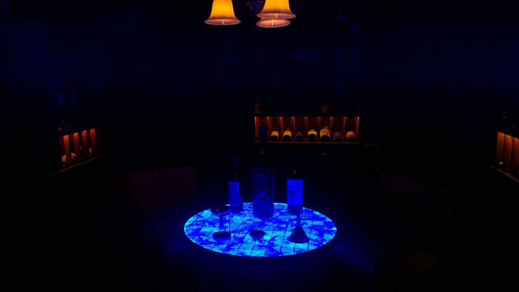
The Formula | Custom RGB LED Tabletop (LumiSplash)
Feeling Inspired?
Contact ATI Decorative Laminates and tell us what’s on your 2020 Color of the Year vision board. An ATI Customer Service Representative is only a quick call away. We can help you bring your ideas to life in a way that looks great this year and all the years to come.
")
")
")