
Living Coral: Exciting Ideas Using the Pantone Color of the Year 2019
Each year, Pantone’s color experts select a color of the year. While designers all over the world always look forward to Pantone’s announcement, the 2019 Pantone Color of the Year is generating a tremendous amount of buzz all on its own. This year, they’ve chosen a lively-yet-mellow hue named Living Coral (or 16-1546, if you want to get technical). After several years in a row of calm, gentle hues, this zesty selection is a welcome change.
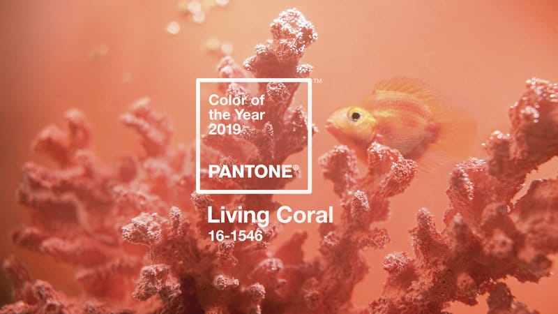
Featured | Living Coral, the Pantone Color of the Year 2019
The color experts describe Living Coral as “An animating and life-affirming coral hue with a golden undertone that energizes and enlivens with a softer edge.” However, don’t be fooled—their choice of Living Coral is not based on aspirations. Pantone’s Color of the Year was chosen through trend analysis across fashion, home furnishings, industrial design, graphic design, and even social media.
But how should you use it? ATI has a couple of ideas.
Bold Feature Wall
A color as bold as Living Coral was made for feature walls, and so are our MirroFlex 4’ x 8’ Wall Panels. If you’re looking to create drama, why not combine the two? Shown below, we’ve paired Wavation + White Gloss Paintable with paint matching Pantone’s Living Coral. The texture of MirroFlex gives this color extra depth. What’s more, the combination is fun!
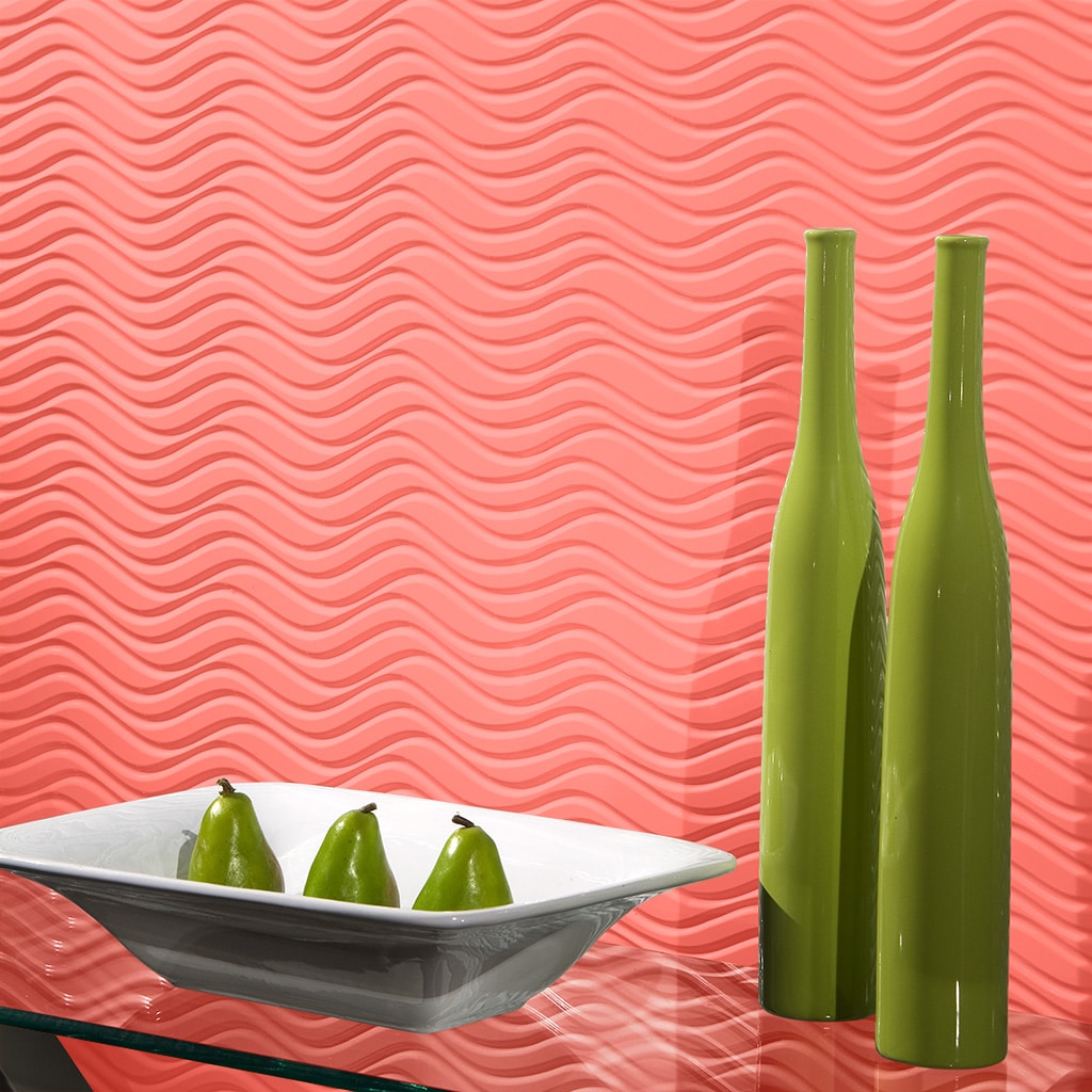
The Formula | Wavation + White Gloss Paintable (Painted in Living Coral)
Subtle Accent Panels
If you prefer a more minimalist approach, you may want to introduce color in a more subdued way. Try using Living Coral as part of a more intricate pattern, featuring less-saturated coordinating colors. ATI’s Fusion program, which combines vibrant graphics with durable substrates, is the perfect way to subtly introduce color. For example, take a look at the kitchen installation below. By combining coral and maroon rings on Fusion FRP, this customer was able to add a pop of color while remaining minimalist. Taking this approach ensures color you can live with in 2019 and beyond.
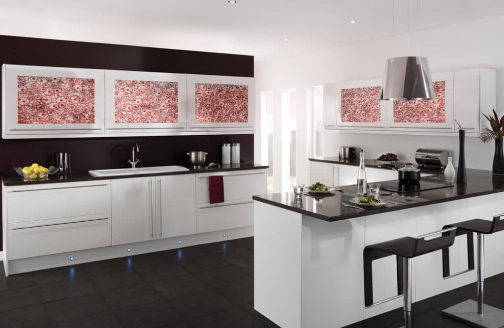
The Formula | Custom Artwork + Fusion FRP
Feeling Inspired?
Feeling inspired and need extra guidance? Speak with an ATI representative today to learn more about MirroFlex and Fusion. We can help you pick the perfect solution for your project.
")
")
")